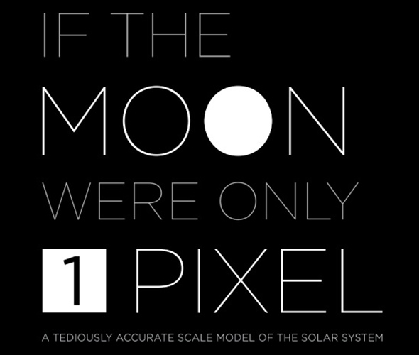
Josh Worth’s HTML scale model of the Solar System
One of my favorite pet peeves is the inability of conventional models to accurately convey the gigantic scale of the Solar System. Most of us grew up with models of the planets made of wood or plastic or spray painted styrofoam balls impaled on bent wire hangers (don’t tell Mommy), or, more commonly, illustrations on posters and in textbooks. While these can be fun to look at and even show the correct relative sizes of the planets (although usually not as compared to the Sun) there’s one thing that they simply cannot relate to the viewer: space is really, really, really big.
Now there are some more human-scale models out there that do show how far the planets are from each other, but many of them require some walking, driving, or even flying to traverse their full distances. Alternatively, thanks to the magic of web pages which can be any size you like limited only by the imagination of the creator (and the patience of the viewer), accurate models can be easily presented showing the average (read: mind-blowingly enormous) distances between the planets… and no traveling or wire hangers required.
via If the Moon Were Only One Pixel: a Scale Model of the Solar System.


